

Dealing with complexity: the Opus Project
Scoping, strategy, and stakeholder alignment on a system that grew bigger than anyone expected
Organization: UCLA
My Role: Lead Designer
Users: 20+ user types: faculty, department administrators, review committees, deans, and the Academic Personnel Office
My work: Research, workflow mapping, information architecture, UI design, a component library on customized Bootstrap, usability testing, WCAG 2.1 AA accessibility
Situation
The charge looked simple: replace a 25 year old faculty review system with a digital one, without changing any existing processes or policies. The original charge fit on a single page. But as any experienced designer knows, what fits on a page rarely captures what hides beneath it.
The system had to be easier than the paper-based one that had been used for over twenty five years. If the system wasn't less time-consuming and easier to use, we hadn't done our job.
Staff tracked cases in their own Excel files. They calculated promotion eligibility by hand from title codes, years of service, and time on the clock. Information lived in several other campus systems, and people had to gather it themselves.
If faculty refused to use the system, nothing else mattered. As John Boykin puts it, the question is whether the cat will eat the food.

Does it satisfy the cat? (Concept by John Boykin)
The client is not a cat. We are not a cat. We cannot compel the cat to do what we want. If the cat won’t eat the food, nothing else really matters! And in this case, cats meant faculty members.
Task
I was the lead designer. My job was to make a system that was faster and easier than paper, for people who had used paper for decades and were anxious about a new system.
We agreed on three measures of success at the start:
No shadow systems. No more spreadsheets, binders, or parallel files. Everything lives in the system.
Less time to process. The new system had to be faster than the paper process.
Accurate data. Administrators can trust what they see, at any time.
We planned to check them by going back to users and asking two questions: do you still keep your own spreadsheet, and is the data in the system correct?
Scoping the Problem
As we dug deeper, a kind of design quantum physics took over. The system changed every time we looked at it. Each layer revealed another beneath it. What started as a simple charge became a complex workflow spanning multiple user groups, committee structures, and institutional policies. We started behind the starting line.
To surface the full scope, we mapped the entire faculty review workflow as a task flow — accounting for every role, task, and handoff. The resulting diagram was enormously long, which was information in itself. But most importantly we had a shared understanding of a very complex process for the first time.

A task flow diagram showing the academic review process. When we showed stakeholders this diagram, they understood the complexity immediately in a way that pages of documentation hadn't been able to. Seeing the full scope of what they'd been asking us to build made the conversation about tradeoffs much easier to have.
One example: the paper process had an elaborate department voting form. We wireframed a digital copy, then estimated the build hours. Seeing the cost, stakeholders agreed a simple vote tally would do.
We did a wireframe / task flow of a voting user interface that would mirror the current paper system.
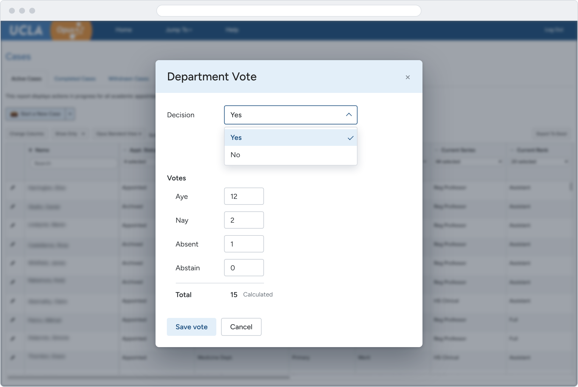
Our stakeholders agreed that this very simple voting tally would do.
Design Strategy
To begin, we agreed on a set of guiding principles that would shape every design decision.
Be on par with modern tools. There's no reason a university system couldn’t be as well designed as the tools people use in their personal lives, like Uber and Amazon. No training required.
Simplify the complex. Faculty review rules are as tangled as taxes, so TurboTax was our model. The system asks one question at a time and shows only what applies. You don't need to be a policy expert.
Show the whole picture. Bring in information from other campus systems, right where people need it.
Let the computer do the math. One particularly hard thing to figure out manually was eligibility for a promotion. It’s based on title code, years of service, time on the clock, and other variables. That's a perfect job for a computer, not a human. We built eligibility calculations in so that administrators got the right answer automatically.
A modal that guides the user on the right path as they’re starting an academic review case.
Build from what staff already did well
We interviewed the staff who managed the process. They had brilliant ways of organizing information, and we used the concepts from their existing spreadsheets directly in our page designs. Many of our tables used the same columns and mental models the staff already relied on.
Staff had been tracking faculty reviews in their own Excel files. We based the Opus case tables on the columns they already used, so the new system felt familiar from day one and replaced the spreadsheets instead of adding to them.
Structured the work with sketching and card sorting
We did a lot of whiteboard sketching to work out some ideas for the navigation and page structure, particularly the sidebar for departmental administrators. Things changed rapidly as our understanding developed.
An early whiteboard sketch of the home page
We sketched navigation and page structure on whiteboards. When wireframes showed the administrator sidebar had too much in it and no clear order, we ran a physical card sort. We listed every task, grouped them, named the groups, and set priorities. That became the site map.
The site map developed out of the card sorting exercise
Tested two navigation designs, and neither won
We had two hypotheses for two different navigation approaches, so we built prototypes and tested them against each other. Neither version we tested won. We ended up using a hybrid of what worked best from each — and discovered things we never would have guessed.
Faculty didn't think of sabbaticals and leaves as "cases." A whole section was labeled wrong.
Eligibility mattered more to users than we assumed, so we made it more prominent.
We had copied Amazon's sidebar filters. When asked to filter by tenured faculty, four out of five people missed them. We moved the filters to the top of the table.
The two sidebar patterns we tested, and the one we ended up with after user testing.
Show Unfinished Work Early
Throughout the process we'd been showing imperfect work to stakeholders — road shows, town halls, meetings with departments and Deans. Showing an unfinished product early might seem like a risk, but it had the opposite effect. Inviting feedback early built trust. A lot of the anxiety about the new system turned into excitement as people saw how it was going to make their lives easier.
Outcome — Including the Parts That Didn't Work

Opus launched. But it wasn't perfect. Our business rules were too strict, and data couldn’t be updated unless the promotion or merit case was approved and closed. The result was that some of our data was incorrect, and some users kept their own spreadsheets anyway. We had failed to eliminate shadow systems, at least in the first year.
So we fixed it:
We relaxed the business rules to fit how the process really works, not how it was supposed to work.
We let administrators edit their own data when it was wrong. Trusting departments more led the central office to trust them more too.
With the Academic Personnel Office, we built an "At My Office" view that showed where cases were stuck, so bottlenecks could be cleared as they happened.
Six months later, the data was more accurate and users trusted the system more. The team still improves it today.
What I learned
Observation changes the system. The act of mapping requirements in detail revealed complexity that no one knew existed. Budgeting time for discovery always pays off.
Show, don't tell. A task flow diagram communicated the problem more effectively than pages of written requirements. Diagrams earn alignment faster than documents.
Scope cuts are design decisions, but so is admitting when your rules were too rigid. Knowing what to loosen is as important as knowing what to build. In our case, we built rules into the system that eventually caused problems for the users.
The instinct to simplify is right. But you have to earn simplicity by first understanding the full scope of the problem.